
Tuesday 24 May 2016
Friday 6 May 2016
Willy Ronis
“By magnificently harmonizing artistic rigor with a
celebration of life, his photography offers a unique vision, one that combines
emotion with reserve, humanism with technical mastery. Few photographers are in
a position to teach us as much as Willy Ronis.” Dhouailly & Cie
Ronis travelled little, mainly photographing the
local people living in and around the Belleville-Ménilmontant region
of Paris which he knew well. Having experience in wedding and christening
photography, Ronis loved the spontaneity of documenting everyday life. His most
famed image, however is ‘Nu Provençal’, a nude of his wife, Marie-Anne
Lansiaux, bending over a sink in a rustic bathroom.
‘Le Bateau Mouche’ by Willy Ronis shows a couple
relaxing on a boat as they sail past iconic landmark, the Eiffel Tower; the
man’s pose reminiscent of a cruise down the river, watching the world go by,
although the woman looks slightly uncomfortable. The couple’s close contact
fits with the Parisian landmark, giving a romantic feel to the image.

Ronis shows another couple taking
advantage of their high vantage point from a tall building, taking in the view
of the Paris cityscape. Ronis has used the technique of shooting from behind
the couple to bring cohesion to the image. Being behind the couple, we see what
they are seeing, giving an insight into their personal experience. Again, I am
struck by the woman’s body language; the straight back and hand placed on her
hip slightly jarrs the otherwise romantic scene.
Walter Bibikow
Walter Bibikow is a travel photographer based in
Boston, MA, USA. His destination photography is supplied to stock photo
agencies as well as buyers worldwide. Spending half of his year traveling,
Bibikow really captures the essence of the places he visits.
In a bid to develop my own personal voice, I often
worry about a need to compromise my style in order to fit the client’s needs.
Although Bibikow has a well-developed personal style, he speaks about
photographing the locations he visits in many ways to fit with the needs of
several types of client, from advertising art directors to travel editors.
Alex Treadway
Alex Treadway’s journal shows a rich and varied
experience, traveling the world, photographing people and places for
organisations such as Independent Magazine, Marks & Spencer and National
Geographic. His passion for travel and remote cultures is clear in his work.
Project: Afghanistan
Treadway was commissioned for his
project on Afghanistan to capture people’s every day working lives for a book
about life in the Himalayas. A combination of portraits and larger landscapes
incorporating workers shows a varied, yet cohesive view through the eyes of a
worker. The overall feeling I get from these images is of a journey from the
growing of crops, to the creation of products and finally to the sale of local
produce in markets and shops. Although the land appears dry and barren on some of
the larger landscapes, other images show fresh and healthy produce displayed
alongside proud and happy workers. The feeling of independence and pride is
reflected in the low and wide perspective often used for portrait images.
Thomas Ruff
A Google Image search for Thomas Ruff initially brings up a sea of
faces in images reminiscent of the passport photo; similarity in crop and
facial expression unites the images as a set. Unlike some of the work Ruff is
known for such as domestic interiors and private sexual acts, these passport
style images are intentionally unglamorous and ordinary, the subjects devoid of
expression. The images were initially in black and white but Ruff eventually
switched to colour.
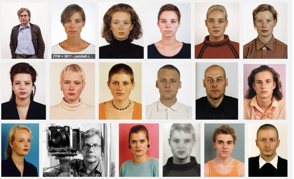
Image search showing Thomas Ruff with some of his Porträts
Ruff used the Porträts to suggest
that it is not possible to represent a subject’s inner life through
photography. Although I am not convinced that this is true, it does open up the
question of how much we can actually show about a person through photography. Yousuf
Karsh, believed that when shooting at precisely the right moment, a man’s
soul and spirit could be reflected in his eyes, his hands and his attitude. I
also believe this to be true.
The more we pose a subject in photography, the less of his or her own
personality we reveal. Ruff had posed his subjects for these images, even to
the extent of instructing them on facial expression. I feel that this posing
and instruction is what leads to the inability to extract any inner life, when
caught unaware, a subject’s life and soul can shine through.
Adam Magyar
Magyar's website hosts a selection of interactive
images in which the viewer is invited to hover over areas of the image to see a
close up of the area.
The images reveal Magyar’s fascination with high
tech cities as well as his ability to use modern technology in the creation of
his work. To Magyar, the city is as much a natural environment as the rain
forest; he feels that the scientific achievements we make are an integral part
of our evolution.
Magyar studies movement; sometimes created by
merging separate images, the study shows people moving en mass, their main
motivation being arrival.
I find Magyar’s work intriguing and quite
voyeuristic. The original image is what we see every day and mostly bypass without
thinking, yet having the ability to zoom in gives a sense of viewing through a
telescope, watching silently and unnoticed.
I have attached a link to Magyar’s website rather than images as his work is about the experience rather than a fixed image.
Monday 2 May 2016
Sporting Events
Having researched several
sports photographers such as Steve Bonini and Adam Pretty, I came away quite
uninspired; great photographers as they are, their style doesn’t really fit
with what I am aiming to achieve. The editorial style, required in advertising
a brand uses posed subjects, styled lighting and heavy editing which for me,
removes the grit and character which I aim to show in my work.
A broader search lead me to
coverage of lesser known sporting events around the world in which photographers
really honed in on the action. The Guardian covers two Italian sporting
traditions, Calcio Storico and Battle of the Oranges, both shot by a selection
of photographers for Reuters and Getty Images.
Calcio Storico, heralded as
the most brutal sport on earth is an ancient form of football from the 16th
century. In teams of 27, using both feet and hands, players are allowed to
headbutt, punch, elbow, and choke opponents in a bid to win the game.
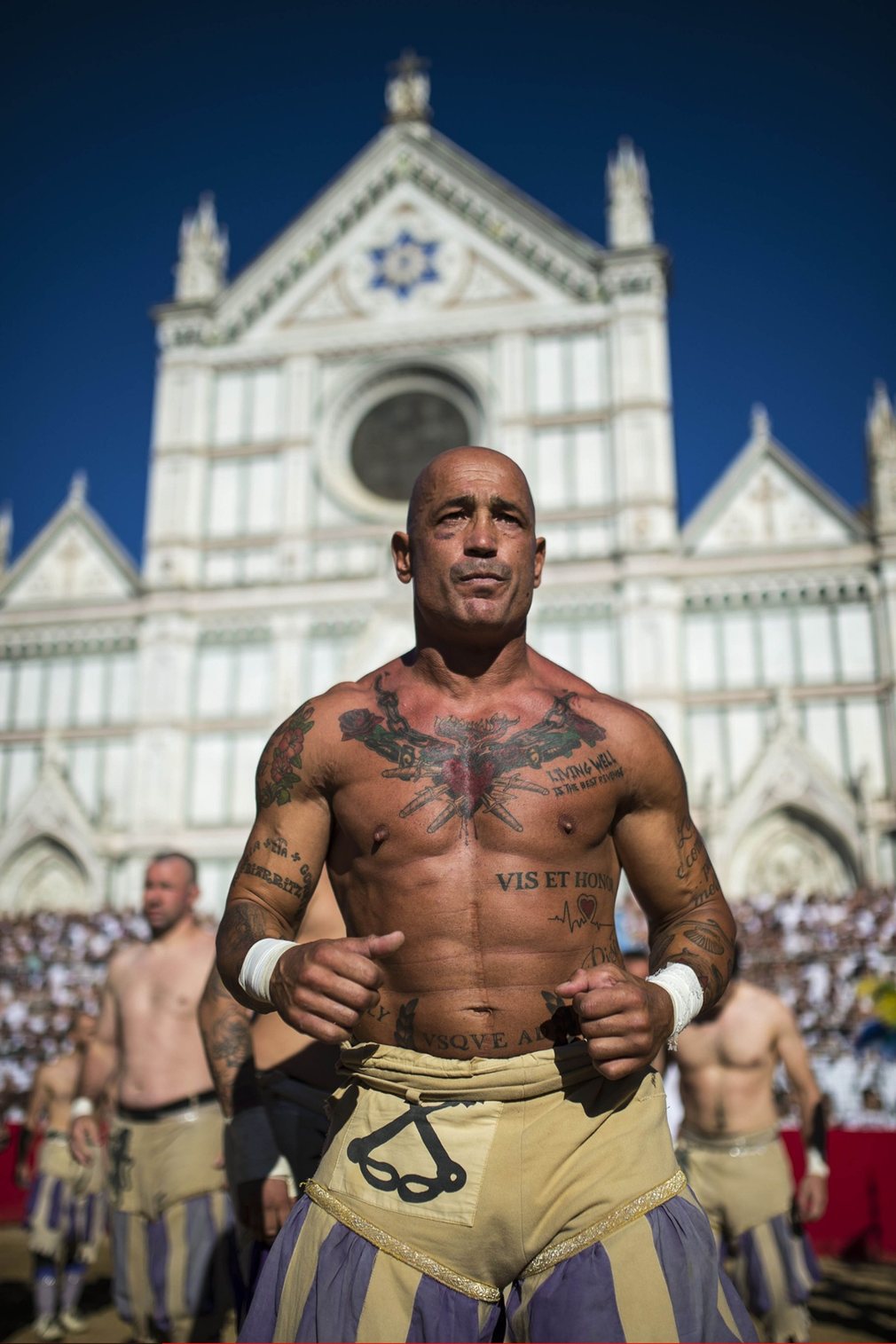
The heat of the day and a
sense of determination is clear as the team prepare for the final - Justin
Setterfield
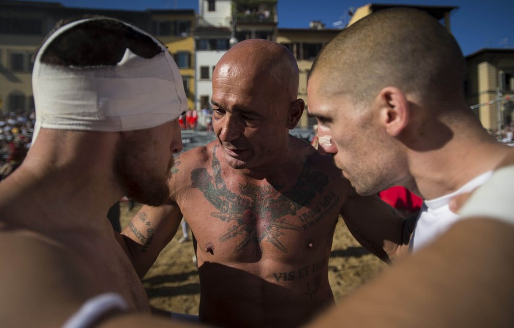
Although the main focus is
on the centre character, this image highlights the risks involved in such a
brutal event - Justin Setterfield
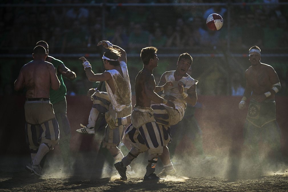
Light filters through as
players fight for possession of the ball - Justin Setterfield

Action shots show the true
emotions felt as the match progresses - Justin Setterfield
Italy's
'battle of the oranges' carnival marks a rebellion against tyrannical lords who
ruled the Italian town of Ivrea in the Middle Ages. The oranges represent the
swords and crossbows that would were historically used.
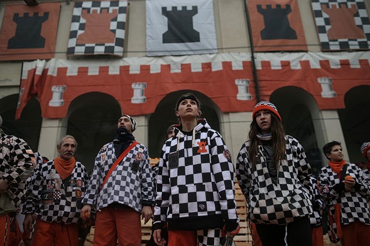
An upward perspective gives
a feeling of power as participants prepare for battle - Marco Bertorelli
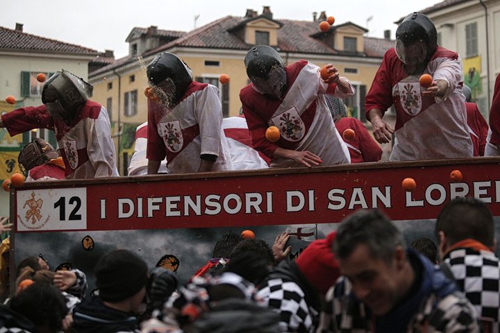
The edge of the truck
divides the two teams; an image of hope as a tyrannical lord takes a blow to
the face - Marco Bertorelli
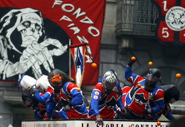
The face of death hovers
over guards in battle dress as one takes a blow to the head - Stephano
Rellandini
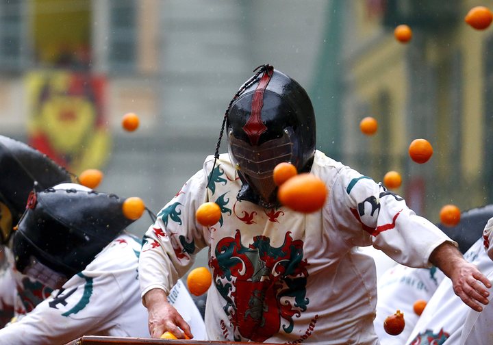
Time stands still as a
battler runs and orange hover mid flight. This image is reminiscent of a
superhero film - Stephano Rellandini
Far removed from the technical images used in sports photography, these examples of events photography give a real sense of occasion. Power, determination and celebration represent the true nature of these most brutal events.
Photographing the ugly - William Eggleston
My first port of call when
deciding to photograph the ugly side of Hull was obviously the colourful Mr
Eggleston. Not only does Eggleston’s work fit with my theme but his rise to
gaining public acclaim from being described as ‘boring and banal’ draws perfect
parallels with Hull’s current situation.
Eggleston’s methods are
quite unusual, a discipline of only taking one photograph of an object fine
tunes his eye to know exactly what he wants before pressing the shutter. With
today’s technology, I feel that we often create too many options, only deciding
on the best perspective once uploaded; how often is it though that the first
image, the view you originally had a urge to photograph turns out to be the
best.
The dye transfer prints
Eggleston used were progressive for his time, only really used to create the
bold images required for advertising. Opposed to the use of colour to attract
in this genre, Eggleston’s configurations often repelled, creating an eerie,
unsettling feel in his images.
The snapshot style and use
of everyday subjects which appalled critics for some time hides a genius at
work with a keen eye for colour and composition. Having researched Eggleston's use of colour for The Art of Photography course and visited his work
many times since, I now feel a need to explore a little deeper into individual
images to inspire my up and coming assignment.
The first image is not
necessarily connected to the assignment but it is an image that ignited my love
of Eggleston’s work. I feel that this image shows a great deal about
Eggleston’s ability to create beauty where many other photographers would fail.
The bold clashes of colour usually associated with youth could have quite
easily overpowered this elderly lady, however somehow, she really pulls it off.
Her slender frame almost makes her part of the chair’s fabric, yet at the same
time, she pops vibrantly from it. There’s something in the way she holds
herself, the turned in toe, the outstretched hand holding her cigarette, the
slightly turned in shoulders reminiscent of many fashion industry images; she
could quite easily be placed in a much classier environment than a leaf strewn
garden with a rickety fence.
I feel that the placement
of this lady, taken from the drab surroundings to this isolated patch of
sunlight and colour gives her a taste of the limelight she’s made for.
Eggleston’s outstanding ability to see and work with colour and composition has
created a work of art out of what could have been seen as a gaudy mess. I could
look at this image for hours.


The next two images are
taken in similar settings but evoke very different feelings. In the first, the
desolate, drab surroundings are punctuated with the high contrast of the gas
station, motel and police car. The lines of the building draw the eye to the
police car while a vibrant red sign beckons towards the motel rooms. Even the
sign to the right of the frame, appears accidental yet frames the image,
drawing the attention to the vast open space in the distance. The red accents
in the image contrast with the cool blues used throughout. In true Eggleston
style, this image leaves us questioning what might have happened in the motel
to bring the police car to the scene.
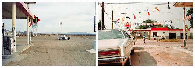

The second image has no
concrete visual element such as the police car to make us question the events
leading up to it, yet it leaves us with a much greater sense of unease than the
first. The man crossing the road seems perfectly relaxed and content, yet the
softly focused car taking up almost a third of the shot reminds us of the
dangers of being in such a place. The street decorations should give a vibrant
happy feeling, yet coupled with the lone figure, long shadows and street
debris, they evoke a lonely feeling of the morning after, when the circus has
just left town.
I feel that the main
element to this image, however that creates a sense of unease is the red colour
cast. Eggleston has said that finds reds difficult to work with as he finds
them to be at war with other colours; I feel that Eggleston’s use of red has
made this image what it is.

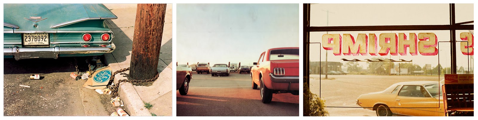
Before you even notice the
physical elements in Eggleston’s images, the slightly surreal colours have
evoked a sense that something is wrong. It is only after this feeling that we
notice that the car is chained to a telegraph pole; the collection of litter
leading us to question how long the car and chain have been there.
Again, the long shadows and
warm tones give off anything but the warm glowing feeling of the golden hour;
the reds are too red and other hues almost non-existent. The leading lines draw
my eye eventually to the red Datsun, this is where the questions begin.
The yellows of the window
sign and car frame a desolate car park. The shot through the window gives a
user’s point of view, giving a sense of waiting for something to happen within
the frame.
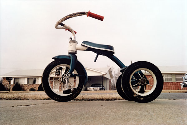
Eggleston uses perspective
as well as colour to evoke a sense of unease. Added to his use of the dark,
bold coloured tricycle against a pale, almost colourless backdrop, the
low, wide angled perspective makes the toy appear much larger than the houses
behind. I often ask myself, if I hadn’t seen Stephen King’s ‘The Shining’,
would I still find this image so chilling; I think I would. The childless
tricycle frames a shadowy carport in a street that hints at, yet is devoid of
people.
Eggleston’s careful, yet instinctive use of colour, light and composition creates images that really distort our impressions of the world around us. I feel that as I photograph Hull in its current conditions, I need to have a completely clear idea of what I want to portray, what sense and feeling I would like to evoke in the viewer and how to go about doing just that.
Subscribe to:
Posts (Atom)