Wednesday, 26 November 2014

Pose & Stance

As with the facial expression exercise, I used Chris and Kat’s photo-shoot to study poses.  In preparation for their wedding, Kat and I had been researching wedding photography and found an article giving posing advice on a website entitled, Rock N Roll Bride by Kat Williams.
Writer, Williams started the blog in the run up to her own wedding in 2007. Realising that she didn’t want to stop after the wedding, she decided to continue giving advice to people looking for more alternative wedding ideas. This is now one of the biggest wedding blogs in the world.
The article gives advice on ways to pose to enhance the shape of given parts of the body:

Bloopers

Great poses

Equipped with print outs of some of Rock N Roll Bride’s suggestions, we set out to the couple’s favourite part of town. I chose a selection of derelict settings to complement Kat’s lacy, vintage dress and to reflect the fun nature of her sixties style dress, we found some brightly coloured graffiti images near the fruit market. 


Waist
The slight turn in Kat’s stance gives a view of her waist at its smallest, an enhancement many women would appreciate. Chris, on the other hand is facing straight on; a broad physique is more socially acceptable in men.


Hands
When shooting portraits, I find people have the most difficulty knowing what to do with their hands; they are the first things to stiffen up and appear tense. In this image, Kat has one hand on her hip with loose fingers giving a chilled out feel. The other hand, sweeping her hair adds some movement to the image, while helping Kat to feel more relaxed; this feeling projects into the resulting shot.


Hips
The idea with this shot was to follow Williams’ advice of thrusting the hips back away from the camera. This has the effect of making them appear smaller due to perspective. This hasn’t worked quite as well as hoped; A more front on stance with the hips bend back towards the wall would have been more successful.


Arms
Kat’s pose in this shot makes the most of her arms; the placement away from the body prevents them from puffing out and makes them appear more toned. The high contrast lighting highlights the curves of the arm, promoting their toned appearance.


Legs
Williams’ advice for legs is to point the toes, bend the legs and create angles. Similar to the arms, bending the legs slightly flexes muscles, making them appear more toned and shapely. This was one of the earlier images in the shoot; Chris was yet to relax, however I was really pleased with how Kat followed tips from our research from the off.

Smile
A natural smile is so important but can be difficult to pull off with a nervous model. Kat had asked early on in the shoot how to make her smile appear natural; I told her that this would happen as we relaxed into the shoot. The set below shows a trick I pulled to evoke a natural reaction in the couple. Placing them in front of some graffiti, which said ‘never yawn’; I asked them to yawn to fit with the text. To my delight, they followed my request and then burst into fits of laughter. I continued snapping away and then turned to Kat and said, ‘and that’s how you get a natural smile’.


This not only produced some lovely images but also took the pressure off Kat as she put her trust in me to find the right moments to shoot. 

http://www.rocknrollbride.com/2011/06/how-to-pose-in-your-wedding-photographs-what-to-do-and-what-not-to-do/

Sunday, 23 November 2014

Focal Length

My husband kindly took a break from his guitar playing today to help with my ‘distorted face’ exercise. I already had a fair idea of the effects of different focal lengths on the face but wasn’t quite prepared for the extremity of the distortion.
The first image, taken at 18mm brings a banana like curvature to the face, which is not at all flattering. Adrian looks like he has an enormous nose and tiny ears as objects, which are closer to the lens, appear much larger.


At 24mm, the distortion is less extreme but still noticeable.


The 50mm setting shows Adrian’s face almost as he looks in real life. I mainly use a 50mm prime lens for close up portraits for this very reason.


Moving on to 80mm, the face is starting to look a little chubby.


A 200mm focal length creates a more compressed image. The nose now appears much smaller in comparison to the ears and the face looks flatter and wider. This may be a flattering look for someone who desires a smaller nose or flatter features, however it does not represent reality.


Having seen just how extreme the distortion can be, I will be much more careful with focal length when taking portraits, especially with close up shots.

A Portrait Sequence

I chose to use a session at my local camera club to create a sequence of shots for this exercise. It was the first time I had participated in this type of session, although I had observed one the week before so knew what to expect. Each photographer had a two-minute turn taking shots of the model; this was repeated three times with costume and backdrop changes in between.

I found the session quite taxing, as I’m not generally a lover of posed photography and with no environment to interact with, my creativity was slightly lacking. I was pleased that the model was quite experienced with posing as this helped me to relax into the shoot.

I gave the model, Olivia direction on which way to turn and where to look, although I did not instruct her so much on facial expression. I felt that chatting to her and making her smile naturally in particular shots would achieve better results.

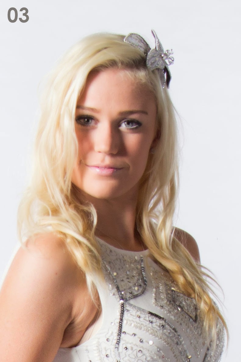
During my six minutes with Olivia, it was difficult to reflect on which shots might have turned out well, however I spent time between shoots reviewing my images. I could see straight away that there was a great variation in quality despite the set up remaining constant. What I noticed at the time was that in some images, Olivia’s hair caused too much shadow from the main light to the left.

Image 03, for example shows a great example of Rembrandt lighting with the triangle of light below the eye, however the large shadow on the other side of the face ruins the image for me, especially with the half smiling expression.


Back home, I uploaded the images and cropped any full body and torso shots to head and shoulders to give a consistent framing for this exercise. I then sorted the images into those I felt were not good at all, those which were acceptable and images I was pleased with.

The first set shown below are the images, which I feel were not so successful. Aside from the lighting issues mentioned earlier, my main issue with these images is the insincerity. I feel that some of the smiles appear to be false and in other images, it seems that Olivia is between poses, thinking about what to do next. When photographing people in more natural, outdoor environments or in their home, I find that the in between shots often turn out to be the best as this is when natural facial expressions can be caught. With Olivia’s experience in modelling, she appears to be constantly thinking about the next pose, so those in between shots appear less relaxed.


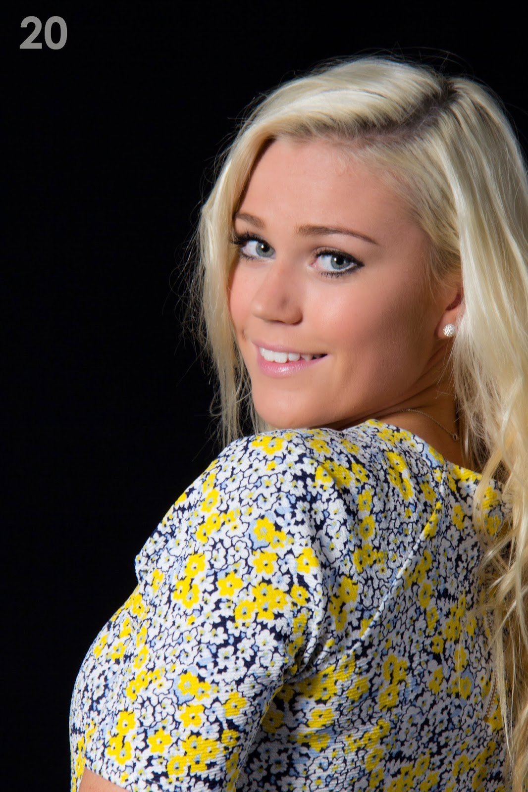
The set of images I have chosen as being acceptable include several vibrant, smiling images; the vibrancy coming from the fact that the smiles are natural, induced by chatting and having a laugh with the model, images 13 and 16 being prime examples. Although I do not see it as a necessity, all of these images have direct eye contact. There are still some issues with shadows from Olivia’s hair but in these images, I feel that it is less of a problem. The black backdrop images are beginning to become more experimental with shots taken from back and side, looking over the shoulder, arms are also coming more into play adding interest.


The images that made it into my good set have a combination of improved lighting and natural facial expressions. Asking Olivia to face to the left of the shot omitted the shadowing issue, giving more even lighting. I feel that in future, I would be more inclined to set lighting at the opposite side to a long fringe to avoid this issue. This is not a hard and fast rule however as some interesting shots can come about using uneven lighting. 


Image 48 was lit from high above as I had asked the model to sit down, much to the shock of other members of the club who told me off for not requesting that the lighting was moved downward. This left a large shadow down one side of her face with the Rembrandt triangle to the other. Unlike image 03, I feel that the lighting effect works in this case.


I have included in this set, groups of images which appear similar at first glance; image 44 & 45 are almost identical except for a slight movement of the head; in image 44, the chin is more dipped and the face turned slightly away from camera, leaving just the eyes peering over the shoulder. This gives a coyer feel to the shot compared to image 45 with a stronger, more direct gaze. The difference is subtle, yet completely changes the feel of the shot.

Image 38 & 39 have equally subtle differences; slightly open lips and a lower gaze give a dreamy ambience whereas the raised gaze in image 39 gives a cheekier edge, maybe due to the fact that a cheeky child would have to look upwards at an adult. The raised arm, touching the hair prevents Olivia from appearing completely childlike yet leaves a playful quality.


It is this playful quality combined with clear, even lighting that makes image 39 my favourite of the set. The raised gaze makes the most of Olivia’s blue eyes and her hair appears fuller and more golden than in many of the other images. Olivia’s watch and hair clip add some interest without detracting too much from her face. If I were Olivia, I would be very pleased with this shot.